Explained: The inspiration behind LFC's new Nike home strip
Liverpool FC's new Nike home kit for the 2020-21 season draws inspiration from the club's history and identity.
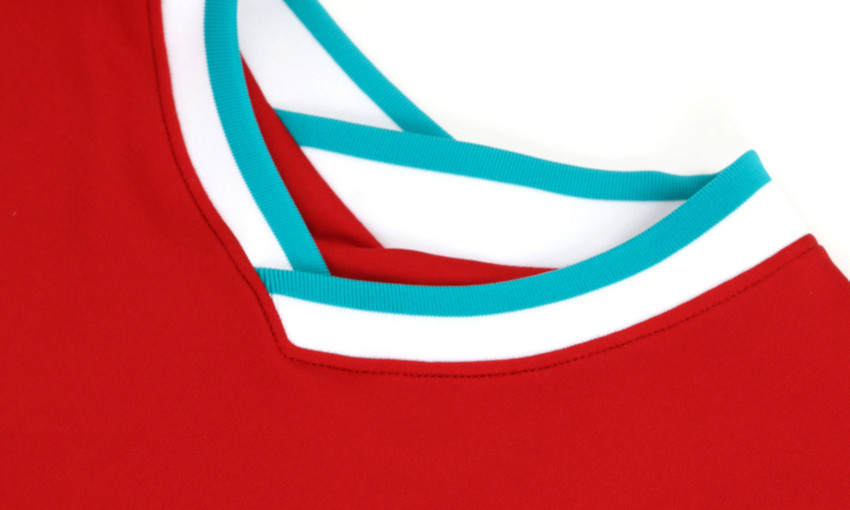
The traditional vibrant red shirt features teal and white around its V-neck collar and sleeves – similar to the Reds' home jerseys between 1993 and 1996.
The colours – red, white and teal – have been a traditional colourway used throughout LFC's proud history and are related to the traditional crest of the club.
Teal also represents the city of Liverpool and is reminiscent of the shade of the Liver Bird that sits at the top of its famous Liver Building.
Scott Munson, VP, Nike Football Apparel, said: "At the start of any new partnership it is important to show maximum respect and we have done that by concentrating on the club's core identity.
"What you have is a clean, strong design, which any fan would immediately know belongs to Liverpool."
Meanwhile, LFC's unique name and number style is again available for supporters this season.
The fonts have been designed to embody characteristics of Anfield and the surrounding area, coming in white for the outfield players' jersey.


